Overview
Objective: Update a restaurant website to match the quality of food
Project Type: Personal, Website redesign
Length: Ongoing (Side project)
Methods: Design principles, wireframes
Intro
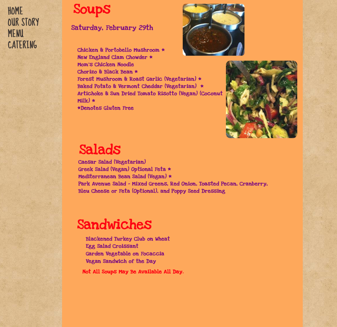
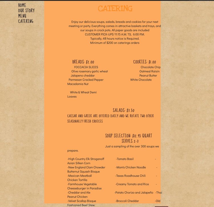
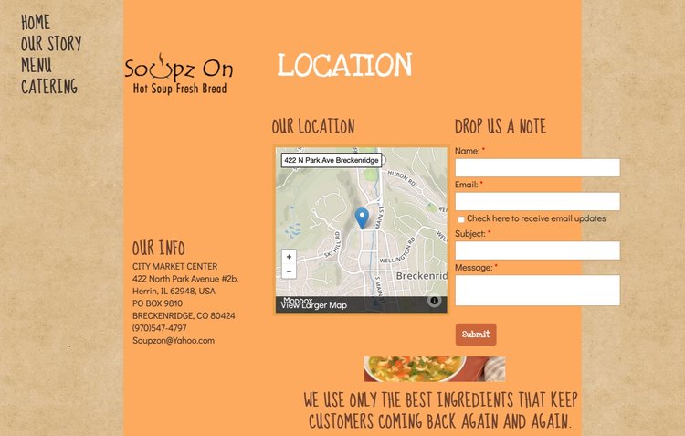
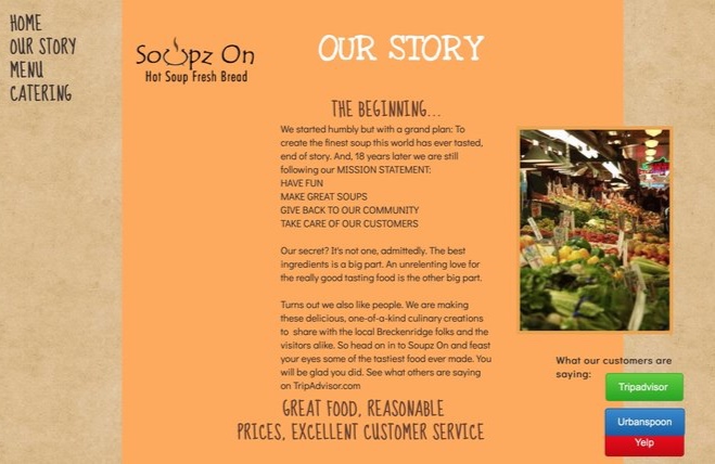
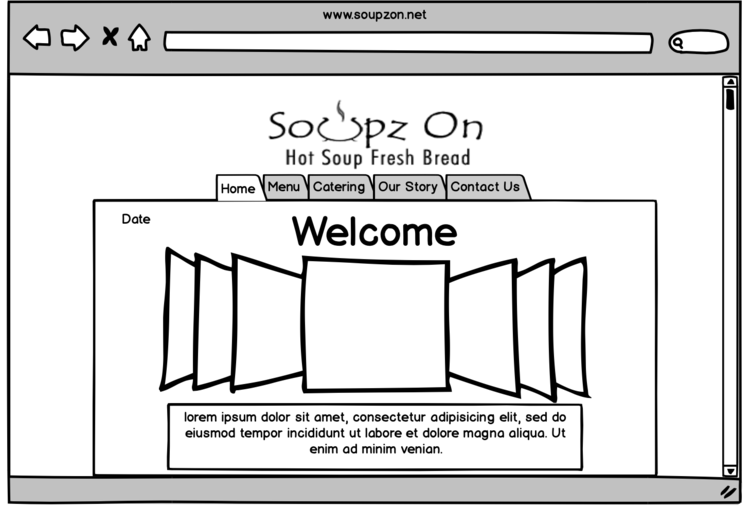
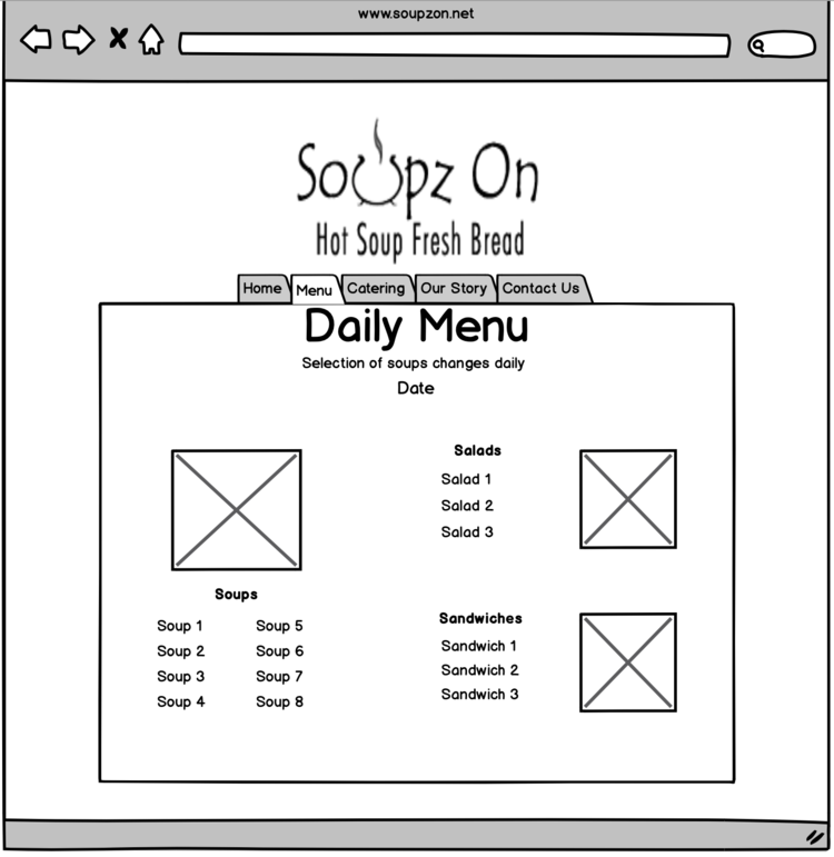
Soupz On is a popular soup shop near world-class skiing in Breckenridge, Colorado. Locals and tourists alike love their ever-changing menu and rely on the website to find the daily soup selection. Unfortunately, the website uses a template that has been edited and misaligned over the years. The website doesn’t do justice to the quality of the product. Using a simple wireframe, I redesigned the website to be cleaner and more organized. I also added several features to enhance the user experience including pictures of the different soups and more information about the location and hours.
I partnered with a web developer to help me make the Soupz On website better reflect the excellent quality of their product and their mission to always make their customers happy.
This is a side project for a family member that I’m working on in my free time. Stay tuned for updates!
Design Changes
I concluded that a total rebuild made the most sense for this site. I retained much of the content and tone of the site, but significantly changed the navigation and visual elements.
I made the new site more minimalist because users want to find the menu quickly and often on the go. Soupz On’s site is intended to be a quick reference for customers deciding where to go for lunch or what to pick up for dinner. The main elements to this change were simplified navigation and minimal color.
