Useability Study
Overview
Objective: Evaluate the design of a robotic coffee stand
Project Type: School, Usability Study
Length: 3 months
Methods: Usability testing, field research, survey, semi-structured interview, task analysis, heuristic evaluation
The Beginnings
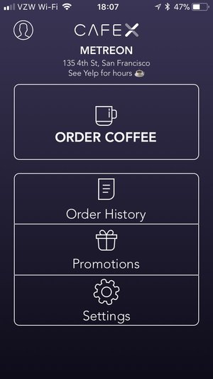
This was my first usability study and the project that really solidified my passion for UX research. My Human Factors course provided an introduction to the UX world through instruction and a hands on project. Over the course of a quarter, we received guidance in designing, executing, and analyzing a usability study about our choice of technology. Shortly before the class started, I stumbled upon a robotic coffee stand in San Francisco called Cafe X. I wanted to explore it more thoroughly and naively believed it was an easy-to-use and nigh flawless system.
A Cafe Study In More Ways Than One
I begin designing the study and prepared for a visit to my beloved cappuccino slinging robot arm. I enticed two of my coffee loving friends to visit the stand frequently until they became expert users. I then interviewed them about their general coffee habits and experience using Cafe X. Lastly, I had them walk me through the process from the moment they decided to order coffee to their first sip. From this feedback, I identified key tasks, which I used to develop a usability study.
Although my classmates would have been convenient participants, transporting them from Santa Cruz to San Francisco for a 10 minute study seemed unlikely to yield enthusiastic volunteers. I decided that guerrilla recruiting tactics would be the best alternative and would give me the opportunity to learn more about recruiting methods. The study was designed to be quick (10 minutes) and participants were offered free coffee in exchange for their time. Participants filled out a short demographic survey initially. Then they performed the requested tasks and answered some follow-up questions for me while they enjoyed their drink.
I gathered data based on the surveys as well as through screen recording throughout the ordering process. I analyzed comments made during the study and evaluated them for patterns. Ultimately, I would have liked to analyze more data than I did, but by the time the project was due, I had thoroughly neglected my other courses and couldn’t justify spending additional time on the analysis.
Conclusions/Results
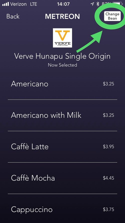
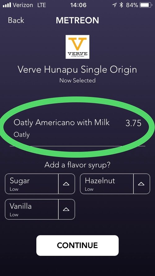
I used data analysis, Neilson heuristics, Norman design principles, and several other methods to identify strengths and weaknesses in the app. I discovered it wasn’t as easy to use as I had initially believed, but still offered a great user experience. I highlighted some of the key problems (the notorious “change bean” button) and suggested solutions to improve these features. I wrote a report on my findings and also presented key points in a lightning presentation in front of my classmates. I realized I had been overly ambitious and wasn’t able to complete the report with the thoroughness I typically strive for, but my presentation was voted the most persuasive by my class of 50+ students. Overall, I think it was an admirable first attempt at UX research (I received an A in the class and was later offered a research assistant position based on the quality of my project). I have monitored the app over the last year and several updates related to my recommendations have been made so it seems I was on the right track.
My full report can be viewed here.
The slide deck for my lightning presentation can be viewed here.
Wireframes (2018 Post-Project Update)
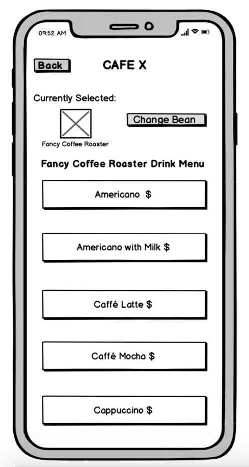
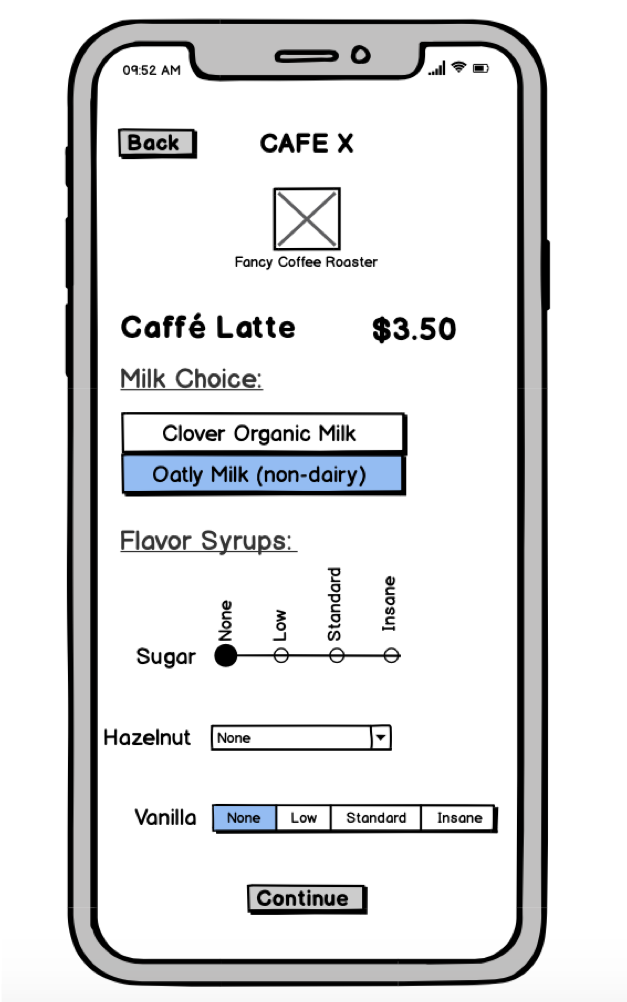
I made wireframes depicting two of the pages that I suggested should undergo the most major changes for usability and user experience.
Note: Cafe X as a company was not involved in or responsible for this project. All conclusions are my own and do not necessarily reflect the company’s opinions or values. I would like to offer my thanks to Cafe X for creating a wonderful product for me to evaluate and for the numerous free coffee credits I was given by employees while lurking around their machine for hours at a time.

